


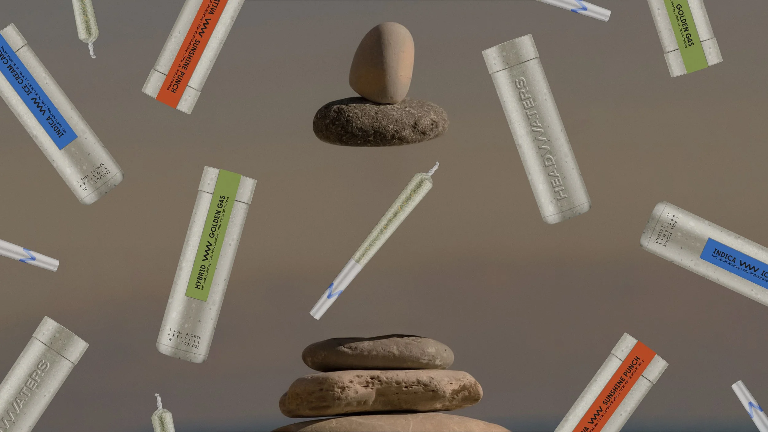


Full re-brand effort for Headwaters including identity, packaging, messaging and merch. Headwaters is a large network of cannabis farms across California that needed a refreshed identity to take their B2B brand into the DTC space.
We developed a custom word mark that introduces a wave like ‘w’ to universally represent both the feeling & the name itself.
Headwaters means ‘the source’ or origin, and as one of California’s largest networks of cannabis farms, we knew they could own that idea. Their premium products & grow operations are the highest of highs, and they’ve been the direct source for many brands across the state for years.
PROJECT DETAILS
ROLE: CD & Lead Design / ADDITIONAL AD + DESIGN: PJ CRISANTI
DELIVERABLES: Visual + Verbal Brand Identity, Packaging, Art Direction, Social Content & Brand Guidelines
YEAR: 2021–2022