


Brand Identity and collateral for Kansas City based brand.
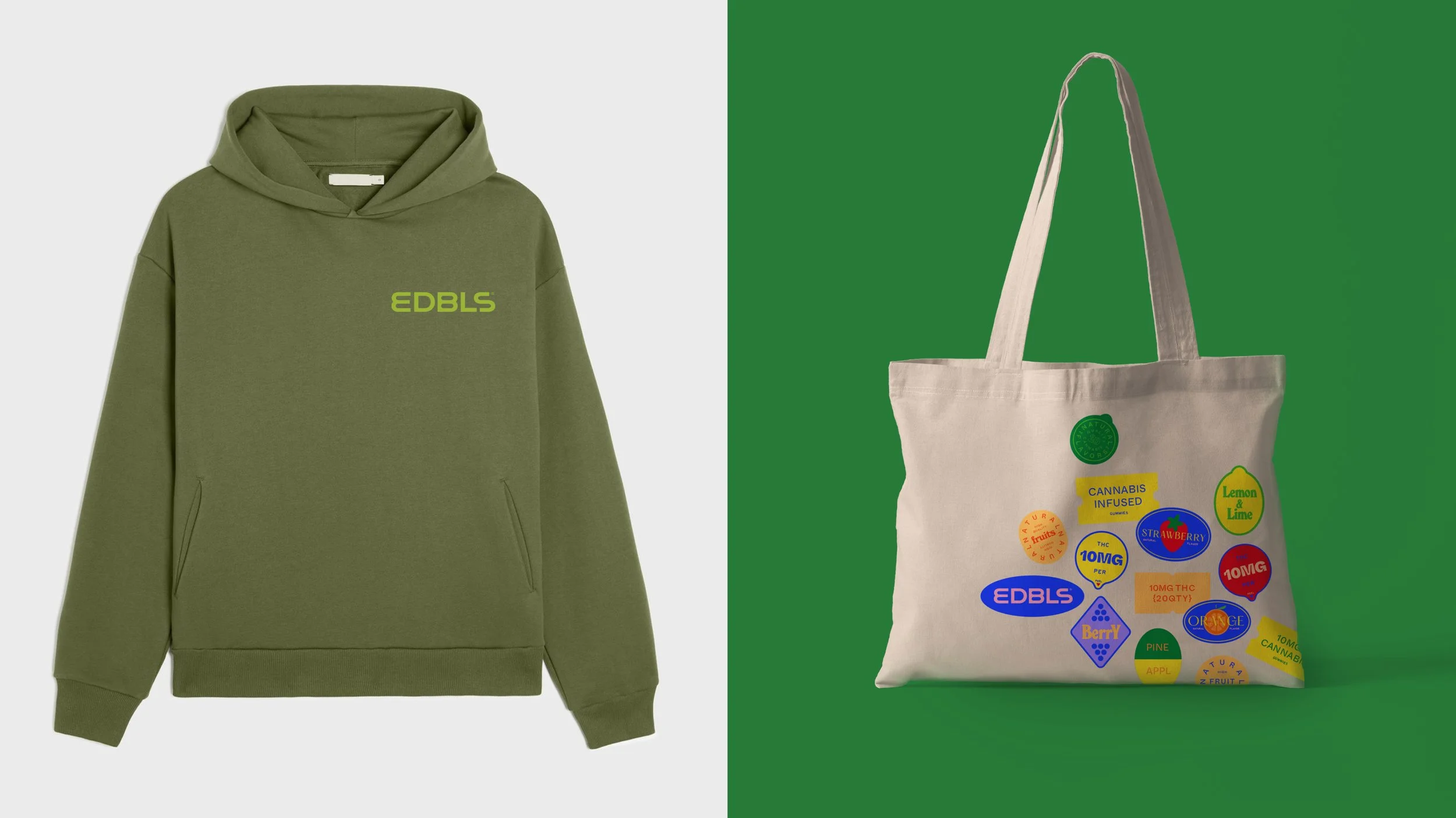
Cannabis is rooted in creativity and empowers feeling. ‘Looks Like It Feels’ became the creative mantra and guiding principle, bringing to life a more vibrant, euphoric design system that helped differentiate the brand in the space.
The founders wanted a bold and vibrant brand that was still very accessible. Higher quality natural flavors is a big differentiator for the line, so leading with unique illustrations and a playful nod to the ubiquitous stickers found on fruit helped establish a fun twist to the graphic language.
CREATED WITH PJ CRISANTI